
Introduction
Quick answer: Product photo color correction is the process of adjusting an image so the product’s colors match the real item exactly. The fastest reliable method is to shoot with a gray card in RAW, set a neutral white balance, make global corrections first, then compare the image side by side with the physical product and fine-tune with masks before exporting in sRGB.
A shopper orders a sage green sweater. It arrives looking olive. Nothing is wrong with the knit, the stitching or the fit. The color simply lied.
That small gap between screen and reality costs online sellers dearly. It triggers returns, negative reviews and a quiet erosion of trust. In a market where buyers cannot touch or inspect products, color is one of the few signals they rely on completely.
This guide explains what causes inaccurate color, why it matters so much for sales, and a step-by-step workflow to match true colors quickly and consistently across an entire catalog.
What Is Product Photo Color Correction?
Product photo color correction is the technical adjustment of white balance, exposure, hue, saturation and luminance so a photographed item looks identical to the physical product. Its goal is fidelity, not artistry. A corrected image should let a buyer predict precisely what will come out of the box.
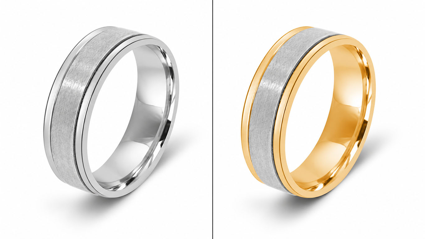
The work ranges from simple global fixes, such as removing a yellow tint from tungsten lighting, to meticulous selective edits that match a specific fabric or finish to a client-supplied reference swatch or Pantone value.
Color Correction vs Color Grading
The two terms are often confused. Color correction restores accuracy. Color grading applies a mood or stylized look, such as warm golden tones for a lifestyle campaign.
For product listings, correction always comes first. Grading can be used in banners and social content, but a product’s main images must show its true color. Stylizing a listing photo almost guarantees disappointed customers.
Why True Colors Matter in Ecommerce
Accurate color directly affects return rates, customer trust and brand perception. When the product a buyer receives matches the photo, they keep it, review it well and come back.
Color Mismatch and Product Returns
“Looks different from the picture” is one of the most common reasons customers send items back. Fashion, cosmetics and home decor are especially vulnerable, because shoppers often choose these products specifically for their shade.
Every return carries hidden costs: reverse shipping, inspection, repackaging, restocking and sometimes an item that can no longer be sold as new. Precise color correction attacks this problem at its source. It is one of the cheapest return-prevention measures available to an online store.
Buyer Trust and Brand Consistency
Color is also a promise. When a customer receives exactly what they saw, your brand earns credibility. When colors drift, buyers begin to doubt your photos, your descriptions and eventually your store.
Consistency matters within the catalog too. If the same navy appears slightly purple on one listing and slightly teal on another, the store looks careless. Uniform, accurate color across every image signals professionalism and makes product grids look cohesive.
What Causes Color Problems in Product Photos
Most color inaccuracies come from three sources: the light, the camera and the screen. Understanding each one makes correction faster, because you know what to fix.
Lighting and White Balance Errors
Every light source has a color temperature, measured in Kelvin. Tungsten bulbs lean orange, shade and overcast daylight lean blue, and many LEDs carry a subtle green or magenta tint. If the camera’s white balance does not match the light, the entire image takes on a color cast.
Mixed lighting is worse. A window on one side and a ceiling bulb on the other can tint different parts of the same product in different directions, which no single global slider can fix.
Reflections add another layer. Colored walls, props or even the photographer’s clothing can bounce tinted light onto glossy surfaces, a phenomenon sometimes called color spill.
Camera Sensors, Lenses and File Formats
Camera sensors do not see color exactly as human eyes do. Some struggle with particular hues, such as deep reds, vivid purples or certain blues, which can shift or clip.
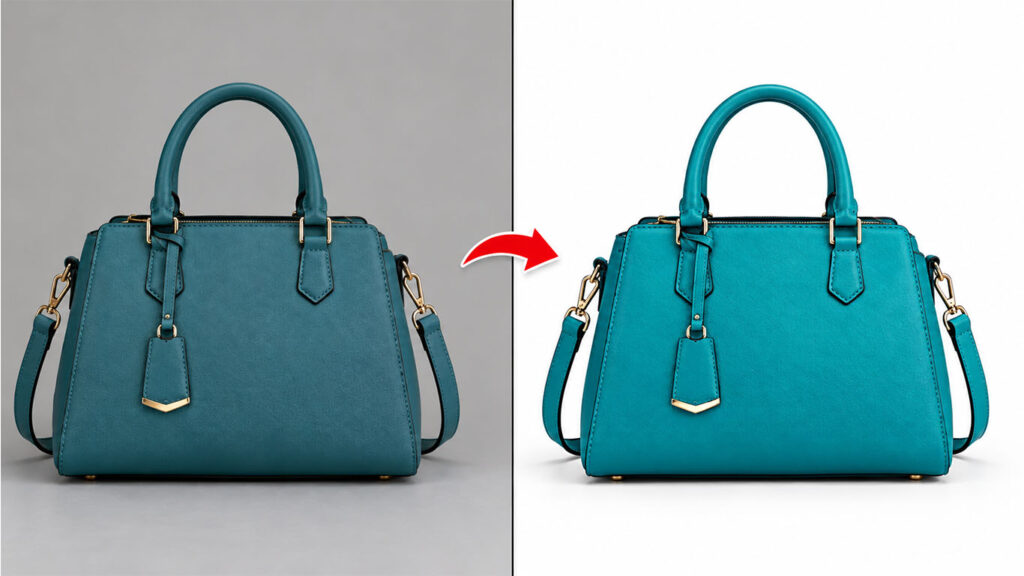
JPEG files make matters harder. The camera bakes in its own white balance and contrast decisions and discards much of the color data. A RAW file keeps that information, giving the editor far more room to recover true color without banding or noise.
Uncalibrated Monitors and Color Spaces
An editor can only correct what they can see. An uncalibrated monitor might show colors warmer, cooler or more saturated than reality, so the editor “fixes” problems that do not exist and misses ones that do.
Color space mismatches cause the final surprise. An image edited in a wide gamut such as Adobe RGB or ProPhoto RGB can look dull or shifted when uploaded to the web, where browsers expect sRGB.
How to Match True Colors Fast: Step-by-Step Workflow
Speed in color correction comes from preparation. The more accurate your capture, the less time you spend fixing it later. Follow these seven steps for fast, repeatable results.
Step 1: Shoot With a Gray Card or Color Checker
Place an 18 percent gray card or a color checker chart in the first frame of every lighting setup. This gives the editor an objective neutral reference instead of guesswork.
In editing, a single click with the white balance eyedropper on the gray card neutralizes the cast for the entire set. A color checker goes further, allowing a custom camera profile that renders tricky hues more faithfully.
Step 2: Shoot RAW and Set a Custom White Balance
Capture in RAW whenever possible. It preserves the full tonal and chromatic latitude of the sensor and makes white balance fully adjustable after the shoot.
Also set a custom white balance in camera using the gray card. Starting close to neutral means smaller corrections later, which keeps the image cleaner.
Step 3: Correct Globally First
Begin with adjustments that affect the whole image:
- White balance: Neutralize the cast using the gray card reference.
- Exposure: Set brightness so whites are clean but not clipped and shadows retain detail.
- Contrast and tone curve: Restore natural depth without crushing blacks.
- Neutral check: Sample a white or gray area. Equal or near-equal RGB values confirm the cast is gone.
Global corrections solve most problems in seconds. Only move on to detailed work after this foundation is right.
Step 4: Match the Physical Product
Now place the real product next to your calibrated monitor under daylight-balanced viewing light, around 5000 to 6500 Kelvin. Compare carefully.
Use Hue/Saturation or HSL adjustments to fine-tune the specific color of the product. If the client supplies a reference swatch, a Pantone value or a hex code, sample the image and nudge it until the values align. This is the step that separates acceptable images from truly accurate ones.
Step 5: Fix Local Problems With Masks
Some issues affect only part of the image: a color spill on a glossy edge, a shadow tinted blue by daylight, or a background that bleeds into the product.
Isolate the affected area with a precise selection or image masking, then correct it independently. Masks let you adjust the product without disturbing the background, or fix a single component, such as a strap or zipper, without shifting the rest.
Step 6: Batch Process Consistent Sets
Once one image from a lighting setup is perfect, save those adjustments as a preset or action. Apply it to every image shot under the same conditions, then make small tweaks where needed.
This is where most of the time savings come from. A catalog of hundreds of images shot under controlled lighting can be corrected in a fraction of the time it would take to edit each file from scratch, with far better consistency.
Step 7: Export in sRGB and Verify
Convert the final images to the sRGB color profile before export, because it is the standard for web browsers and marketplaces. Then check the results on more than one screen, including a smartphone, since most shoppers browse on mobile.
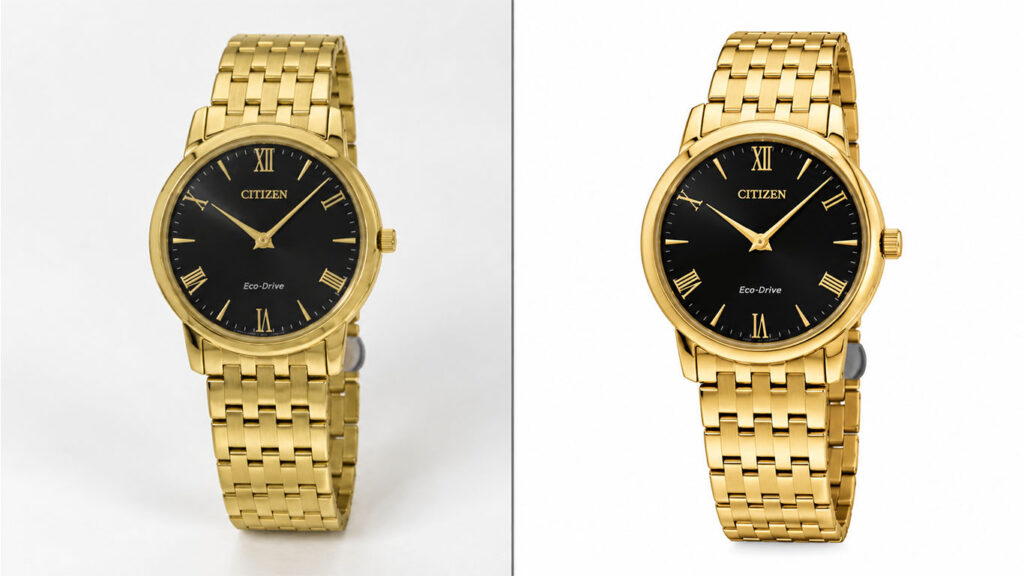
A final side-by-side look at the product and the exported image confirms that what the customer sees is what they will receive.
Color Correction Tips by Product Category
Different products present different chromatic challenges. Tailor your approach to the material.
| Product category | Main color challenge | Correction focus |
| Apparel and textiles | Fabric texture absorbs or reflects light unevenly; dark colors lose detail | Match dye shade to the physical sample; protect shadow detail in black and navy |
| Jewelry and watches | Metals pick up color casts from surroundings | Keep silver and platinum neutral, gold warm but not orange; preserve gemstone saturation |
| Cosmetics and beauty | Shoppers buy by exact shade | Match foundation, lipstick and eyeshadow to swatches with extreme precision |
| Furniture and home decor | Wood tones and upholstery shift under mixed light | Correct warmth carefully so oak does not turn orange or walnut turn red |
| Electronics | Glossy surfaces reflect colored light | Remove color spill on screens and casings; keep blacks truly neutral |
| Food and beverage | Colors must look fresh and appetizing | Stay accurate while avoiding dull, gray-tinted results |
Creating Color Variants
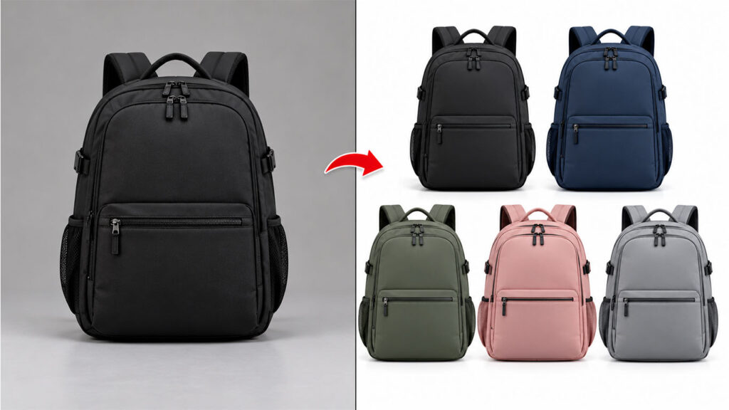
Many stores sell one product in several colors. Rather than photographing every variant, editors can recolor a single high-quality image to create the others. This saves shoot time and guarantees identical lighting, angle and styling across all variants.
The key is accuracy. Each recolored variant must still match its real-world counterpart, so always work from physical samples or exact color references.
Platform Requirements and Color Consistency
Marketplaces add their own rules. Amazon, for example, requires main images to use a pure white background of RGB 255, 255, 255. Any color cast on the backdrop, even a faint gray or cream tone, can cause an image to fail its automated checks.
This makes background neutrality part of color correction. After balancing the product, confirm the background reads as pure white without blowing out the edges of light-colored products.
For Shopify, WooCommerce and other self-hosted stores, the priority is consistency. Products in the same collection should share the same white point, brightness and tonal style, so the grid looks uniform. Professional e-commerce photo editing helps keep every listing aligned with both platform rules and your brand standards.
Common Color Correction Mistakes
Even experienced editors fall into these traps. Avoiding them saves rework and returns.
- Editing on an uncalibrated screen. Every decision becomes unreliable. Calibrate monitors with a hardware colorimeter regularly.
- Correcting by memory instead of the product. Human color memory is poor. Always compare against the physical item or a verified reference.
- Over-saturating to make products “pop.” Vivid colors may attract clicks but lead to disappointment on delivery.
- Ignoring the background. A tinted backdrop can push the product’s color in the opposite direction and fail marketplace checks.
- Using one global fix for mixed lighting. Different areas may need different corrections. Use masks.
- Exporting in the wrong color profile. Adobe RGB files uploaded without conversion often look washed out on the web.
- Inconsistent treatment across a set. Editing images one by one without presets causes subtle shifts between listings.
DIY or Outsource?
Small sellers with a handful of products can learn the basics of color correction in Lightroom or Photoshop. A gray card, a calibrated monitor and the workflow above will produce good results.
The challenge appears at scale. Hundreds of SKUs, multiple color variants, tight launch deadlines and strict marketplace rules turn color work into a production bottleneck. Precise shade matching for cosmetics, jewelry or textiles also demands experience that takes years to build.
That is when outsourcing makes sense. A specialist editing team brings calibrated workflows, trained eyes and the capacity to process large batches with consistent results, often within 24 hours. Your team stays focused on sourcing, marketing and selling.
A practical middle path works well for many brands: handle the shoot in-house with a gray card and RAW capture, then send the files to a professional editor for final correction and variant creation.
Frequently Asked Questions
What is product photo color correction?
Product photo color correction is the process of adjusting white balance, exposure, hue and saturation so the colors in a product image match the real item. Its purpose is accuracy, so shoppers receive exactly what they saw online.
How do I fix a color cast in product photos?
Use the white balance eyedropper on a neutral gray or white area, ideally a gray card shot in the same light. If the cast affects only part of the image, select that area with a mask and correct it separately.
Why do my product colors look different online?
Common causes include incorrect white balance, mixed lighting, an uncalibrated monitor and exporting in a color profile other than sRGB. Shopper screens also vary, so accurate, standardized files give you the best chance of consistent display.
Can you match product colors to a reference sample?
Yes. Editors can match an image to a physical sample, a Pantone value or a hex code by sampling the image and adjusting hue, saturation and luminance until the colors align.
Should I use color correction or color grading for product listings?
Use color correction for product listings, because buyers need accurate colors. Save color grading for lifestyle images, banners and social media content where mood matters more than exact shade.
How long does professional product color correction take?
Turnaround depends on volume and complexity. Many professional editing services deliver standard batches within about 24 hours, with faster options available for urgent projects.
Conclusion
Accurate color is not a cosmetic detail. It is a promise to your customer. Product photo color correction keeps that promise by making sure every shade on screen matches the item in the box.
The fastest path to true colors starts before editing: control your lighting, shoot RAW with a gray card and work on a calibrated screen. Then correct globally, match the physical product, fix local issues with masks, batch process consistent sets and export in sRGB.
Get these fundamentals right and you will see fewer returns, stronger reviews and a catalog that looks cohesive and trustworthy.
If you would rather hand off the detailed work, Clipping Path World’s Photoshop color correction service matches product colors to your references, creates color variants and delivers marketplace-ready files. Request a free trial to see the results on your own product photos.